UX DESIGNER
CASE STUDY
PHOENIX
App/ Website
PHOENIX is an app for people going through life changing events

THE DESIGN PROCESS

PHOENIX
CASE STUDY
A resource for users going through life changing events
PRODUCT: The Phoenix app/ website is an app to help people find support and rebuild their lives after life changing events, both global and personal. Phoenix is a hub of information and support around the initial event. The full version of the site would also assist with recovery and goal setting, and to reaching out and reconnecting to the community. This case study focuses on the resources and support information portion of the app, and was conceived to help support people rebuilding their lives after Covid-19.
DURATION: April- May 2022

Product: PHOENIX
An app and website for people experiencing life changing events
PROBLEM: It is hard for users to easily find information about resources and support services. It is especially difficult when a user is experiencing a traumatic or life changing event, or are trying to heal and rebuild their lives.
GOAL: To create an app and website that has a plethora of information in one place, from emergency trauma support information and resources. In the final version of the app, the offerings would be divided into three different phases: Finding information during life changing events,( phase 1 ), to goal setting and healthy lifestyle resources ( phase 2 ), to community/ social support building (phase 3 ).

My Role & Responsibilities
Designer
MY ROLE: Lead UX designer
MY RESPONSIBILITIES: Research, persona creation, comparative audits, journey maps, ideation, low fidelity prototyping in adobe XD, user research, high fidelity prototyping (app), site map creation, responsive website creation, low fidelity prototyping, user research, high fidelity prototyping for website and iPad.
RESEARCH

User Research Summery
Research & Ideation
I did research and interviews, and created personas. I created problem statements, conducted a comparative audit, and did ideation exercises.

Personas
Support
The research from the interviews revealed that many users don't like using multiple apps for organization or for support and they like to receive alerts.

Personas
Privacy
I was most surprised by how everyone I interviewed was very clear about not having their personal information stored online in an app, especially personal medical information, this influenced how I separated out the apps and made the emergency info ( the app this CASE STUDY focuses on ) information available without signing in.

Comparative Audit
Public and Private Institutions
The competitive audit spanned both govt and non govt entities, it covered both emergency and self care support services, paid and free apps. I compared the CA govt app, Calm app, Happify, and Aloebud. It was interesting how much data gathering private companies tried to do, and how the govt website “almost” got everything right in terms of design. The best site was a small mental health website/ app (Aloebud) designed by someone in the community. It was accessible, simple and affordable.
Ideation
Brainstorming and Wireframes
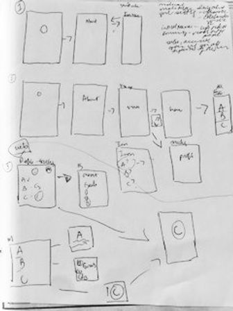
The ideation phase was really fun and fruitful, between doing multiple brainstorming activities and drawing many different versions of wireframes. The original prototype ended up having too many ideas and possibilities and had to be scaled back. It was challenging as a designer trying to find a balance between being thorough and exhaustive with resources and creating something that wasn’t overwhelming to the user.
THE DESIGN

Design
Wireframe and Prototypes
As part of the design process I created digital wireframes, low fidelity prototypes of 3 different versions (sizes): for iPhone, iPad, and Website. I then conducted moderated usability studies.

Digital Wireframes
Updated Wireframes
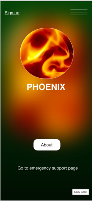
The original wireframes were confusing, and users didn’t understand what the app was for. So I simplified and clarified the About page. I also included a safety button, in case the user needed to exit the app.
LOW FIDELITY PROTOTYPE

Low Fidelity Prototype
iPhone, iPad, Website
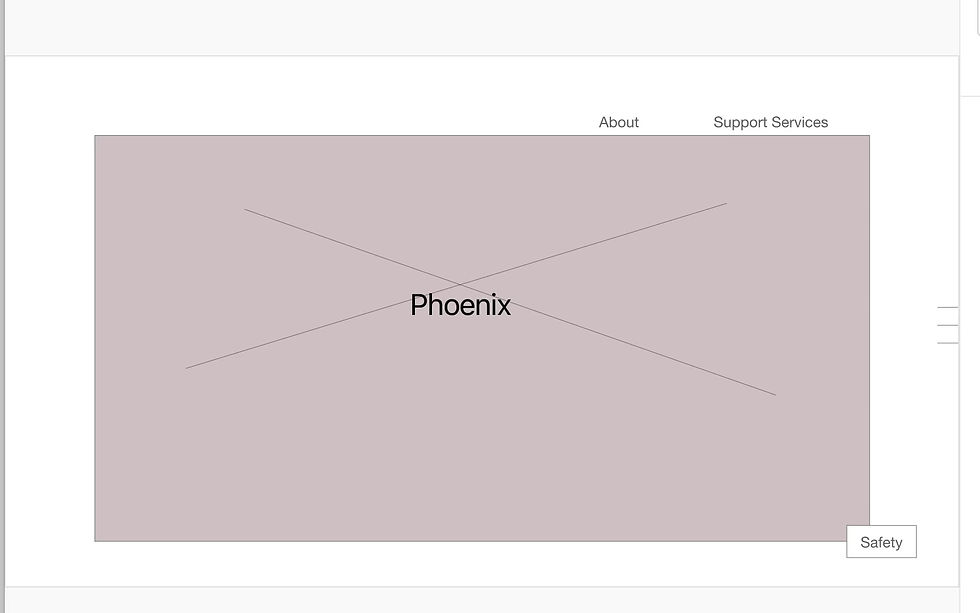
I created 3 different low fidelity prototypes: One for an iPhone app, one for a website and one for an iPad. These links are for the more streamlined version of the app. Links are below:
USABILITY

Usability Studies
Moderated Studies
I conducted moderated usability studies, where users provided feedback on the app

Usability
Findings I
Navigating through the initial version of the app was confusing for users. Having both trauma support and goal setting seemed incongruous and poorly designed.

Usability
Findings II
Users were also confused as to what the point of the app was, and that it needed to be simplified

Usability Studies
Findings III
Users also found the scope of the app too complicated and overwhelming, thus the decision to split the app up into 3 different apps
MOCKUPS

Refining the Design
Mockups and High Fidelity Prototypes
I made mockups based on the feedback from the usability studies. I also made high fidelity prototypes for iPhone, iPad, and a Website

Mockups
Mockup I
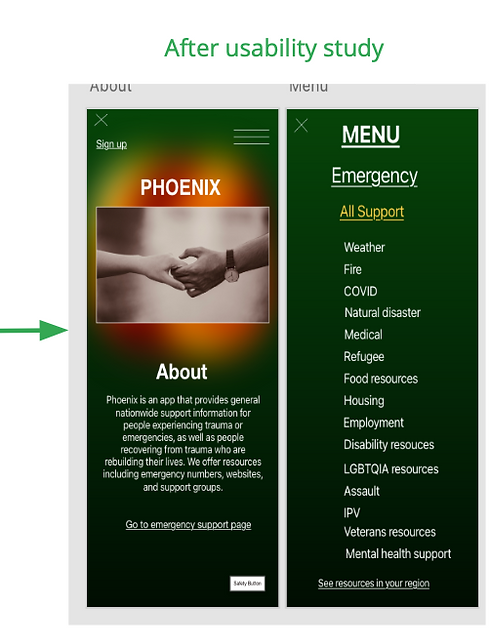
The very first mockup that I used in a usability study, was a combination of traditional support services, and goal setting ( self- help healing).
Mockup
Mockup I Update
This proved to be too confusing for testers, so I decided to split the offerings up into separate apps. This version is the support version (general services for support, emergencies and trauma)

Mockup
Mockup II
One of the pieces of feedback I got was that the app was overwhelming, so a simpler layout would be easier to navigate

Mockup
Mockup II Update
I made the images larger and kept them vertical, instead of having a vertical and horizontal option
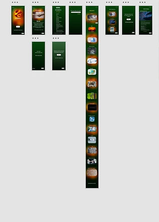
Mockups
Mockups III

High Fidelity Prototype
Adobe XD Prototype


ACCESSIBILITY

Accessibility
Color Contrast
The colors used in the text and the background passed the WCAG contrast checker for accessibility.
Accessibility
Trauma Informed Design
I included a safety button in case users needed to exit the site immediately. In the final version of the app, the safety button would either exit the user out of the app or return the user to a blank browser window.

Accessibility
Financial Accessibility
Keeping the app free and available offline, was based on both the comparative audit I did, which showed how expensive some of the support apps are. The information could also be accessed without signing in, which was based on privacy concerns from the user studies.
RESPONSIVE DESIGN

Information Architecture
Sitemap
The sitemap showed that the information flowed a little better on the app (which was what the original design was for). It also felt like the website lent itself to becoming more expansive and comprehensive.

Responsive Design
Consistency and Continuity
I wanted to make sure that based on the feedback from the usability studies, there was a consistent design and layout throughout the different screen sizes, with some variability for interest.
CONCLUSIONS

Takeaways
Impact & Learnings
IMPACT: Created an app that easily and quickly provides resources and support for users encountering emergencies or trauma. The response was very positive; "This is a good idea, I like how everything is in one place”. "I like the colors, it’s easy to read”.
LEARNINGS:I learned that there is such a thing as trauma informed design, and I begun to explore it in this case study, and look forward to utilizing it more in my work. I also learned that there is a lack of financial accessibility and privacy in health apps

Next Steps
Sign-in
I would test if there was any demand for a sign- in profile feature that would store user history and important information.
Next Steps
Goals and Community
I would test and see if there was a demand for either a separate goals app or an app for connecting different communities together either during or after a life changing event

Next Steps
Holistic Experience
Finally I would test all three versions of the app and see if they were useful, or if there were bits and pieces from either that could be incorporated into the original website or iPad app.

